New Building ~ Parking it.
If any of you have passed by the building site, you may think it's been abandoned, a ghost town, a blur. In some ways, it is. Moving in has been parked. Again. Sadly, we are just now getting base put on the parking lot. It seems that right when it dries out enough to be able to do anything, we get hit with rain again. I'll be honest, it's hard not to get a little sad and frustrated when you see the forecast. I feel like this whole process has been the BIGGEST trust walk of my life. I know it hasn't but it sure is beginning to feel that way.
It's hard to plan things when you don't even know where you are going to be operating so I feel almost like a compass that has a bad spring in it or like I'm boinging around like the hairs on my head on a high humidity day. I know there is an end in sight and I'm standing and believing in that. For now, since there are no cool photos to show you about any fantastic updates, I'll continue my explanation of my new logo aka tattoo idea 😜😁
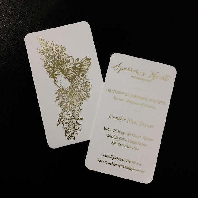
I mentioned last week about the crazy process I've been through with getting the logo created. Now I'll share how I got the vision for it (and the business cards I ordered). I started by looking into tattoos. Pretending I was brave enough to even get one I did some Instagram research. I found several stunning ideas and that immediately lead me to a new logo idea. Sometimes I get these ideas and trying to share/explain what I see in my head is a challenge. Hopefully I can share it here and you'll feel as deeply as I do about it. Well, maybe not AS deeply as me but maybe some of what I feel.
1. I LOVED the idea of a sparrow with breast feathers in the shape of a heart, duh. That works perfectly!
2. I LOVED the idea of the flowers in a garland type shape, stretching on top and below the sparrow.
3. I LOVE my family and wanted to incorporate them somehow. They are why I do what I do.
4. I found a business card I LOVED and wanted to figure out how to do something similar.
I love, love, LOVE symbolism (see a thread here?) so I immediately knew the flowers needed to have meaning, not just random flowers I liked. I started doing some research, knowing that back in the Victorian age they would send secret messages with flowers called posies. I started to research it, trying to find books with the definition of the meanings of different flowers. They are hard to find! I happened across one novel called "The Language of Flowers" by Vanessa Diffenbaugh and checked it out from my local library. I knew it wasn't exactly what I was looking for but it seemed interesting and had a "flower dictionary" in the back. I fell in LOVE with it (definite thread) and actually purchased a copy to share with others and reread in the future. I cherished the idea of making my flowers even more symbolic so I started some additional internet research on the meanings. You'll be surprised at the differing opinions. I realized there were way too many options and I needed to know WHAT flowers I wanted first, then I could find the meanings behind them (to make sure they didn't mean affair or death or something horrid, lol!).
I had another brilliant idea during this process. Birth flowers, DUH! Why not include birth flowers for my family?!?! I already knew that if I did a tattoo, I'd have to have a poppy for my dad. Why not include my mom, Greg AND my kids?! How special would that be?!?
I started compiling a list and was BLOWN. AWAY. when I started reading what each flower meant/symbolized. I looked up both the world's definition and a spiritual definition. It's almost creepy how they line up with each person's personality. I was also thrilled to discover some cool meanings for greenery that would work perfectly for the silver part of the card design.
Since my husband, dad and mom were and will continue to be my covering, their flowers took place above the head of the sparrow. I decided that I should be able to represent myself in a flower as well (I LOVE my birth flower) so my rose is next to the sparrow. Since we are all the covering for my kiddos, their flowers took the position below the sparrow.
I was originally going to have the laurel leaves (victory and eternal life) be the background of the business card and the olive branches (peace and God's promises) be in the garland. I decided that if I wanted a tattoo of this, I'd want both in the garland so that's what I had Oliva do.
I decided having a fully decorated card (adding a background all over) like the Jukebox sample, using my design, wouldn't look good with all the flowers, etc. (way too busy) so I changed my plan and was going to do the bouquet in silver and the bird in gold. When it came time to order the cards, I kinda freaked. Being the frugal gal that I can be I almost choked when I saw the price. I'm all about quality and making sure I get the best for my clients and business and I know that sometimes means spending money. But these are just business cards, right? In the grand scheme of things, with all the new business expenses and the major hold ups we've had that have cost us a ton, I had a hard time justifying the purchase at this time. I have no idea why I never really figured it out before now, and I love your cards but DANG!, sorry Jukebox that's a struggle. I tried to find another company but couldn't find any one that does the fancy dual metallic foil so it was them or no one. Since it looked like I'd have to use them (and spend over $1k!), I decided to poll a few of my friends to see if they REALLY preferred the dual foil look vs the single foil option. Was it worth all the money I'd be spending? I sent some preliminary images to them (not telling them about the cost difference) and all but one chose the solid gold design. When I told her the price difference, the solid gold suddenly became the winner!
Since I ordered my previous cards from Moo and I knew they offered a "gold foil" option using your own artwork, I decided to see if that price was doable. It was definitely better (about 1/3 the price) so I moved forward, biting my fingers as I clicked "purchase". Committing to 1,000 business cards is big for me!
They came in and for the most part I really like them. The paper has a velvet feel to it so it's definitely unique and is different to the touch. However.... I am somewhat disappointed because they aren't a true "gold foil" in my opinion. Gold foil to me is an actual metal film that is stamped into the card, resulting in a spectacular, high end feel and appearance. The "gold foil" at Moo is more like their "spot glass" look over a "gold" ink. It's an embossing technique instead of true foil imprinting. If you've ever done scrapbooking, stamping, etc. and used embossing powder with a heat tool that's exactly what it's like. Raised and rubbery, not metallic foil. I personally don't think they should label it as "gold foil". Kinda misleading IMHO. Without seeing one in person, you can't truly tell the difference.
I will say that the people at Moo were unbelievably helpful in getting the artwork in proper format. Since I don't have adobe illustrator, they vectorized it for me and what a blessing that was! For that, they will definitely get a "thumbs up" from me!
The cards will work for now. Maybe when these are all gone I'll be able to find someone that does TRUE foil that doesn't charge a ton. It is only a business card, right?
I do love my design and there are so many things I've been blessed with through this process. I mean, if a business card is the worst of my concerns... I'm a BLESSED woman for sure!
Hopefully next week's #fixerupperfriday post will have better news for the parking lot. I hate to ask, but please pray for the rain to stop, at least for a good solid week 😙 I would LOVE to move forward and MOVE IN 💕😆
Until next week, happy #fixeruppperfriday everyone!
His eye is on the sparrow and I know He is watching over me. ♥ Matthew 10:29-31


Comments
Post a Comment